I can't tell you how many times I've heard someone bash artists for choosing a hobby as a career. Now joking is one thing, I do it myself, but there have been completely serious comments made by many of my own (non-art) professors, telling us that being an art major is a waste of time. Now for the time being I'm going to ignore the financial aspects to this argument and focus on one that I think goes relatively unacknowledged. The reason people bash the arts is because they don't understand just how much art is a part of their day to day life.
Art isn't just a painting in a museum, or a sculpture in a hotel lobby. It is literally everywhere. It affects you constantly. Do you own clothes? I'm going to assume the answer is yes. Where do you think they came from? I can assure you that though they may have been constructed by machines, they were not thought up by them. Those clothes you own were all designed by people. And those people were all more than likely discouraged from becoming designers. They were told time and time again not to pursue an art career. Okay, maybe you don't care much about clothes, how about the furniture in your house? That was all designed by people too, people who again, were probably told not to go into that field. Do you like movies? TV shows? What's your favorite one? Well it doesn't matter because regardless of if you watch Game of Thrones or Modern Family, without artists, that show wouldn't exist. Costume design, set design, script writing, those are all done by artists. Look around you. Literally everything has some element of design to it. The label on your bottle of coke. The design on your shower curtains. Even the way your tea kettle looks. These were not just flippant choices made by the manufacturers. These were all carefully created by artists.
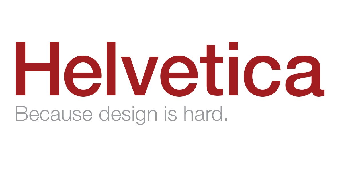
Do you know what the world would look like without art? I can tell you, it wouldn't look good. If everything was created purely for function, we'd have a pretty crummy time of it. We might as well just wear Star Trek onesies, because who needs form when you can just have function? Every font you see is Helvetica. Every. Single. One. Because again, it's the most functional, why have anything else? The design on your couch, rug, guitar strap, lampshade, even your napkins... those wouldn't exist. It would all just be blank. And all those things that you live for? The things that you do with friends, that help you relax after a long day? Movies, plays, TV shows, books, video games, music... hope you can learn to do without. Are you seeing what I'm getting at here? Art and design, it's literally everywhere.
So you might be wondering what the point of that little rant was. Sure art is everywhere and we need it, but that still doesn't mean that having a career in art is actually a good idea, the market is totally risky. And you're right, the field isn't easy, but it's important. And keep in mind I'm not trying to undermine any of the non-creative fields. We obviously need engineers, accountants, lawyers, doctors, etc. But here's the deal. Those folks are what keep us alive, but it's the artists that make us want to live. You can't have one without the other, so please, let's stop treating that other half like shit. If you have kids or know someone who is creatively talented, don't discourage them from the arts. Support them. Because they are important. And support the art around you. The field wouldn't be so damn hard to get a job in if people valued the arts a little more. Go to your local museum, visit art shows. In fact, why spend money on decorations for your home at Target when you can have a one of a kind piece that was hand made? Yes, you might spend a little less at Target, but remember, you get what you pay for. And for gods sake, don't let your schools cut their art programs! I can't reiterate this enough! I was lucky enough to attend schools that had great art programs, but when I was in college I met kids who had never even had an art program in their high schools. That's absurd.
Unless you want to live in some horrid art-less dystopia where everyone miserably attends work then goes home in their box-cars to sit on their dull gray furniture and stare at a blank wall then you better damn appreciate the arts. Okay maybe I was a little dramatic there but seriously, this shits important. Here, go find some art and appreciate it. :]
Showing posts with label design. Show all posts
Showing posts with label design. Show all posts
Thursday, March 27, 2014
Tuesday, March 18, 2014
Design For The Non-Designer
In my opinion, it's good to have a basic knowledge of a variety of fields, regardless of what your interests or career is in. And for the most part, we do try to educate ourselves in many different ways. I'm no doctor, but I try to know the basics on health and nutrition; I'm also no woodworker, but I know my way around tools and simple building constructs. Well here's something that I see most people ignore when it comes to basic knowledge, design. We assume that being artistic is just something you're born with, and there's not much you can do if you don't got the gene. Well I've never been convinced about that argument anyways, but regardless, these are tips for anyone to utilize. Just because you don't plan on being the next Picasso, doesn't mean your party invitations or classroom newsletters can't look a little better.
Color
The worst, though not most common mistake I see is "vibration" in design. Vibration occurs when two colors clash (usually two bright colors) and create an afterimage effect that interferes with what you're seeing. Basically, it's a pain to read. Here's some examples.
These are not good color combinations. See how hard it is to read? The letters all seem to interfere with each other!
The best way to avoid accidentally creating vibration is by refraining from using two bright colors. Simply put, adding a light (pastel) color with a dark color usually has the best results.
Isn't this much easier to read? The colors don't compete with each other. These non-vibrating color mixtures work much better.
Font
As said by Massimo Vignelli in the film Helvetica, "I can write the word dog with any typeface and it doesn't have to look like a dog, but there are people that when they write dog it should bark!" Now I'm not saying you can't have fun with fonts, but tone it down a notch. Again, are you more concerned with having a "fun" newsletter or having a legible one? The reason you're typing something up is to convey information, so make it easy on the reader. Choose your fonts wisely. Now this is a pretty subjective topic, but I'm going to lay out some of the basic information that most designers would agree with.
For the header of what you're writing, you can get a little creative. I would never use this text for the body paragraphs of a letter, but for a large header, it's fine. Again, graphic designers might throw a hissy fit at even going near some of the more expressive fonts, but screw that. A little is okay if you ask me. Just don't go nuts.
These are some examples of what you don't want to use for a 12pt body paragraph. (But I think would be okay for a simple, 24pt header of a birthday invitation/themed newsletter/etc.)

And here are some examples of fonts that do work for the main text.
And here are some examples of fonts that do work for the main text.
 |
| (All these fonts either came with my laptop or were downloaded for free off of Google if you want them!) |
Basically, you want your font to be as close to Helvetica or Times New Roman as possible. You can spice up the title of the page with something fun (as long as it's legible), but keep the rest of the body simple for the reader. (An example would be the title of this blog vs. the body text!)
Oh and Comic Sans. I should probably talk about that. If you don't already know, the font Comic Sans is considered by the design community to be the worst font ever created. Not kidding. But here's the thing, grade school teachers go nuts for it. I've seen it all over everything aimed at children basically my whole life. So here's my rule, you can use Comic Sans. But only if you're writing something to be read by 8 year olds. If this is to be read by anyone over the age of 12, then back the eff off and find some other font to use because anyone who knows the stigma associated with it will find the document completely unprofessional.
Images
I remember opening my high school yearbook and being horribly disappointed at how poorly done it was. Pixelated photos of our soccer team, mixed with in focus close ups looked awful. Don't make that mistake. Here is the basic rule of resizing pictures. You can make it smaller, but you can't make it bigger. If you grab a picture and resize it to be much larger, the image will get blurry. It will look bad. So if that means not using something because it won't fit the area, so be it. Trust me, giant pixelated images are much worse than empty space.
I might do more tips later, but I hope these help for now!
Subscribe to:
Posts (Atom)